An in-depth Nexus 10 review
Last updated Dec 14, 2012 — 7713 views Google recently introduced its first 10-inch Nexus branded tablet, the Nexus 10, which boasts a stunning 2560×1600 (300ppi) IPS display and a slim/light/comfortable design. This in-depth review examines the Nexus 10’s hardware and user interface, and compares the Nexus 10 both to its smaller sibling, the Nexus 7, and to its 10-inch Android tablet competition.
Introducing the Nexus 10
When you first encounter the Nexus 10, you’re likely to be impressed by its bright, crisp 2560×1600 (300ppi) IPS display, which Google touts as “the world’s highest resolution tablet display.” In contrast, the iPad 3’s 9.7-inch “retina” display has 2048×1536, 264ppi resolution.
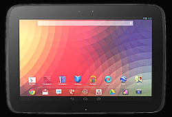
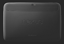
Google Nexus 10 front and back
(click images to enlarge)
Physically, the Nexus 10 stays well within the 0.4-inch thickness and 22-ounce weight specs that we’ve grown to expect from well designed 10-inch tablets. And speaking of form factors, the Nexus 10 has an elegant appearance, with gently rounded corners, just a hint of ovalness, and a rubbery back surface that makes it more comfortable in the hands than Apple’s iPads.

Just 0.4-inch thick, despite its beefy 9,000 mAh battery
How Samsung, which builds the Nexus 10 for Google, managed to squish so much computing muscle along with a 9000mAh power pack into such a svelte body is a mystery. At least one factor was the use of Corning Gorilla Glass 2, which enables the use of up to 20 percent thinner glass while maintaining “industry-leading” damage resistance, toughness, and scratch-resistance, according to Corning.
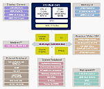 |
Exinos 5250 SoC |
| (click to enlarge) |
Under the hood, the Nexus 10 sports a Samsung Exinos 5250 system-on-chip (SoC) application processor, which integrates dual ARM Cortex A15 CPU cores, clocked at 1.7GHz, plus a rich set of system controllers (see block diagram at right). Memory resources include 2GB of high-speed DDR3 SDRAM and 16 or 32 GB of flash, and a quad-core Mali T604 GPU (graphics processing unit) turbocharges the tablet’s 2D and 3D graphics performance.
Comparing the Nexus 10 to its smaller sibling
Perhaps because they were designed in conjunction with two different hardware partners, the Samsung-manufactured Nexus 10 and Asus-manufactured Nexus 7 differ in several seemingly arbitrary ways.
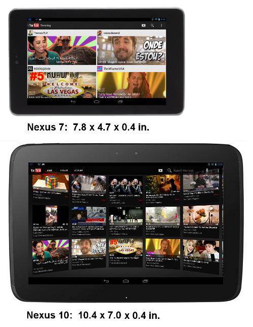
The table below compares the Nexus 10 and Nexus 7 from a features and specs perspective.
Comparison of Nexus 10 and Nexus 7 features and specs
| Nexus 7 | Nexus 10 | |
| Processor | 1.3GHz quad-core | 1.7GHz dual-core |
| RAM | 1GB | 2GB |
| Internal flash | 16GB or 32GB | 16GB or 32GB |
| microSD expansion | no | no |
| Display resolution | 1280×800 | 2560×1600 |
| Display size | 5.95 x 3.7 | 8.55 x 5.35 |
| Display area | 22 sq-in | 46 sq-in |
| Display density | 216ppi | 300ppi |
| Front camera | 1.2MP | 1.9MP |
| Rear camera | no | 5MP |
| Video output | no | micro-HDMI |
| WiFi | yes | yes |
| Bluetooth | v3.0 | v3.0 |
| GPS | yes | yes |
| Cellular data option | yes | no |
| Battery | 4325 mAh | 9000 mAh |
| Size (in.) | 7.8 x 4.7 x 0.4 | 10.4 x 7.0 x 0.4 |
| Weight | 12 oz | 21 oz |
| Price (WiFi-only models) | $200 (16GB) $250 (32GB) |
$400 (16GB) $500 (32GB) |
Several additional features are not mentioned in the table. For example, both tablets have NFC short-range wireless, which implements an “Android Beam” function, and both have built-in accelerometer, gyroscope, and magnetometer sensors. Unique to the Nexus 10 are a magnetic “Pogo pin” port on the bottom, for docking and charging, and a barometric sensor, which can be used in altimeter applications.
Also, the Nexus 10 implements MIMO (multiple-input and multiple-output) WiFi, whereby multiple receive/transmit antennas can boost WiFi performance by up to 400 percent, according to Google.
Nexus 10 out-of-box user experience
Below, we take a quick tour of the Nexus 10’s user experience, including its default homescreens, apps, and widgets. Notice how the Nexus 10’s default, out-of-box homescreen is refreshingly free of flashy wallpaper-and-widget eye candy, unlike the usual vendor-branded tablet.
Default Homescreens       
|
Below, you can see the 29 Android apps that come preinstalled by default on the Nexus 10. The screenshot shows the contents of the tablet’s “App Drawer” screen.
Default Apps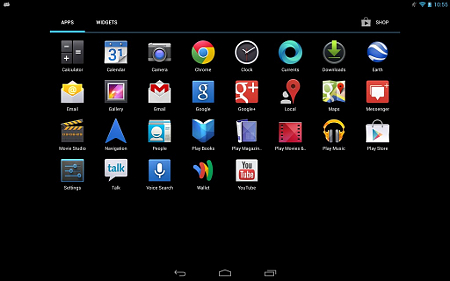
|
The screenshots in the group below demonstrate Android 4.2’s default homescreen folder function. Creating folders is simply a matter of dragging one app launcher onto another, just like on an iPad. Android’s default folder function accommodates a combination of up to 40 app-launchers and 1×1 widgets per folder. The only option is to name the folder — there are no appearance or style settings — so what you see below is what you get. Later, I’ll demonstrate a much more flexible and configurable Android folder app, which I added to my Nexus 10.
Default Homescreen Folder Function     
|
Customizing the Nexus 10
Since the Nexus 10 is based on Android, there’s quite a lot you can do to reconfigure its appearance and functionality, without having to resort to “rooting” the device. The first thing I always do is set the homescreen wallpaper to my favorite nebula image; you may have noticed that in the preceding group of screenshots.
Changing the homescreen launcher…
Next, I installed Nova, an alternate homescreen launcher, which offers many more configuration options than the tablet’s default homescreen launcher. Among its many settings options, Nova lets you enable/disable the Dock, and configure how many cells there are for app-launchers and widgets on the homescreens by specifying the number of rows and columns.
The screenshots below show two versions of my Nexus 10’s primary homescreen, in both landscape and portrait orientation. The left pair shows the tablet’s default Android homescreen launcher, with 40 cells in the main area and eight in the Dock; those on the right show the revised Nova-based primary homescreen, with 56 cells and the Dock disabled.
|
Two Homescreen Launchers: Standard (left) and Nova (right) |
(click images to enlarge)
Installing an alternative folder function…
The next step in my tablet tweaking process was to install an alternative folder function. Folder Organizer offers significantly more flexibility than the default Android folder function. With Folder Organizer, I was able to configure a Nova-based Nexus 10 homescreen with 14 folders, 32 app-launchers, and three widgets (two 4-cell, one 2-cell), as shown below.
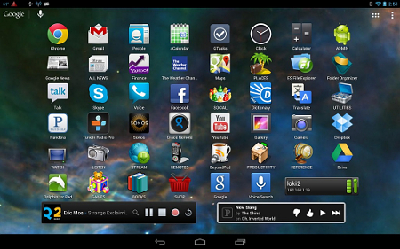
(click image to enlarge)
The screenshots below show the contents of my homescreen’s 14 Folder Organizer-based folders.
Alternate Homescreen Folder Function               |
Keyboard alternatives
Although the standard Android onscreen keyboard keeps getting better, I prefer the Hacker’s Keyboard, a free download from the Google Play market. The set of screenshots below demonstrate some of the differences between these two virtual keyboards, and also make a case for Google Voice Typing, which can save you lots of time and keystrokes in many situations.
|
Standard Android keyboard…        Hacker’s Keyboard…    Google Voice Typing…  
|
Although onscreen typing is certainly easier on 10-inch tablets than on 7-inch models, I find that a Bluetooth keyboard greatly increases my typing speed and accuracy, so I like to use one whenever I’m working at a desk or table. The photos below show two Bluetooth keyboards that work well with the Nexus 10: the Logitech Android keyboard and the Zagg ZaggKeys Flex.
Using the Nexus 10 with Bluetooth keyboards from Logitech (left) and Zagg (right)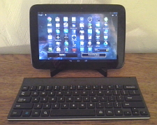 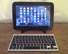 |
(click images to enlarge)
One tablet for work and play
To find out what the Nexus 10 could do, I loaded it up with more than 200 Android apps for device management, communications, productivity, news, weather, e-books, multimedia steaming, games, and more. The screenshots below show 32 different apps running on the Nexus 10. Visit DeviceGuru’s extensive tour of 50 favorite Android tablet apps to see numerous screenshots demonstrating these and other apps.
Wide Range of Apps Running on the Nexus 10                               
|
(click images to enlarge)
The bottom line
In summary, Google’s new Nexus 10 Android tablet pushes the 10-inch tablet market envelope in numerous ways, not least of which are its dazzling 2560×1600 (300ppi) IPS display and its slim/light/comfortable design. Although it’s not perfect, it’s certainly a great choice for both work and play. Here’s a quick summary of its pros and cons…
Pros:
- Dual-core ARM Cortex A15 CPU, plus quad-core Mali GPU
- Dazzling 2560×1600 (300ppi) IPS display
- Kept up-to-date with latest Android releases
- Nonslip rear surface
- 9000mAh battery pack
- Standard micro-USB connector for data and power
- Standard micro-HDMI connector for video out
- Wireless extras: NFC; WiFi direct; WiFi MIMO
- Magnetic Pogo pin charging dock
- Supports multiple user accounts
Cons:
- Bluetooth ought to be v4.0
- No microSD expansion
- No cellular data option (currently)
- Adobe Flash player no longer officially supported
- Lacks app-independent A/V beaming infrastructure
 (click to enlarge) |
At $400 (with 16GB flash), the Nexus 10 strikes a good balance among features, performance, and cost. You can save money with a Samsung Galaxy Tab 2 10.1 or Lenovo IdeaTab S2110, but you’ll miss out on the Nexus 10’s super-hi-res 2560×1600 screen and its substantially higher performance.
 (click to enlarge) |
The other option would be Samsung’s high-end Galaxy Note 10.1, which edges out the Nexus 10 in some respects performance-wise, but lacks the Nexus 10’s super-hi-res display. I’ve used both tablets in parallel for several weeks, and though I like the Galaxy Note 10.1 a lot, the Nexus 10 has won me over with its 300dpi screen, more pleasing look and feel, and more up-to-date OS. Also, I’m not particularly interested in Samsung’s “innovative” handwriting input and multi-windowing apps. Call me old fashioned, but on my tablets I’d rather type and talk, than scribble and scrawl!
Further information
For more details or to purchase a Nexus 10, visit Google’s Nexus 10 microsite.
| Be sure to check out DeviceGuru’s continually updated Android tablet comparisons: |


Really? You’re reviewing a tablet and you’re not even going to compare it to the elephant in the room, the iPad 4th Gen? The omission makes your review far less useful.
Unfortunately the Bluetooth Keyboard does not play as nice with the Nexus 10 as evidently the i Pad does. You have to use a paid application to try to override the on screen Nexus 10 keyboard, and occasionally things don’t go as planned. I am really disappointed with the way the Blue Tooth Keyboard integrates with Nexus 10. Just try to enter data into one of the browsers, and you get a Chinese fire drill going on. With a true Office type program, the Keyboard works OK, but with most of the other software on the device, it doesn’t work very well at all. They should have a app or widget that allows you to easily switch between the on screen keyboard and the Bluetooth Keyboard. Right now in the settings, the on board keyboard seems to be embedded and you have to use an application like External Keyboard Helper Pro to be able to use the Bluetooth Keyboard. That works partially, but not on all of the apps on my device.
I recently installed an inexpensive app that provides a widget for switching between the external BT keyboard and the internal on-screen keyboard. I tried a few, but this one seems to work best:
“Bluetooth (Null) Keyboard” by Darken
https://play.google.com/store/apps/details?id=eu.thedarken.nkv2
I haven’t used it a lot yet, but so far it seems to work better than a couple others I’ve tried.